
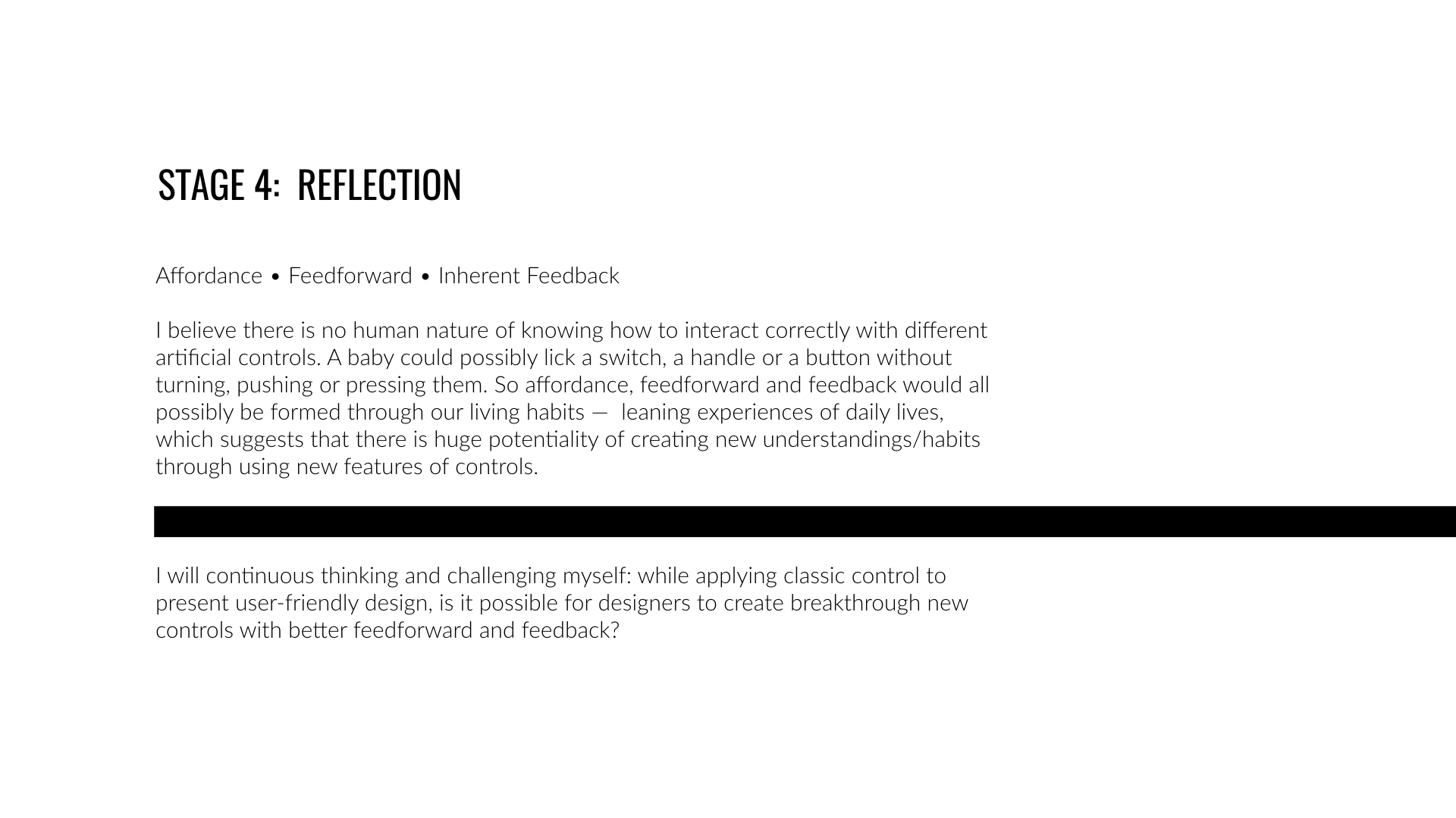
Environmental Data Display
Data-driven environmental displays are valuable to users when they anticipate users' needs and change data without requiring interaction from the users. So designing presentation, logic governing data change, and the structure of the data must be informed by understanding of the needs of stakeholders and users.
My Role Status Project Type
Visual Designer Completed Self-directed
Design Journey
/ 0 Warm-up
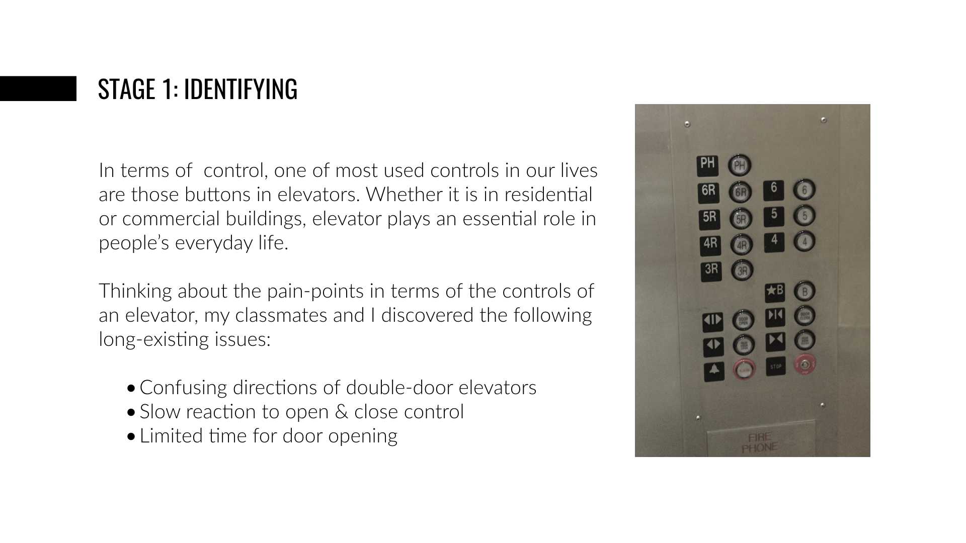
Controls are a fundamental building block of interaction design. To understand a user’s context, intention, behavior, environment and physical limitations in order to create a control that is elegant, intuitive, easily learned, and creates value for the user, I was asked to design a control for one part of my everyday life.
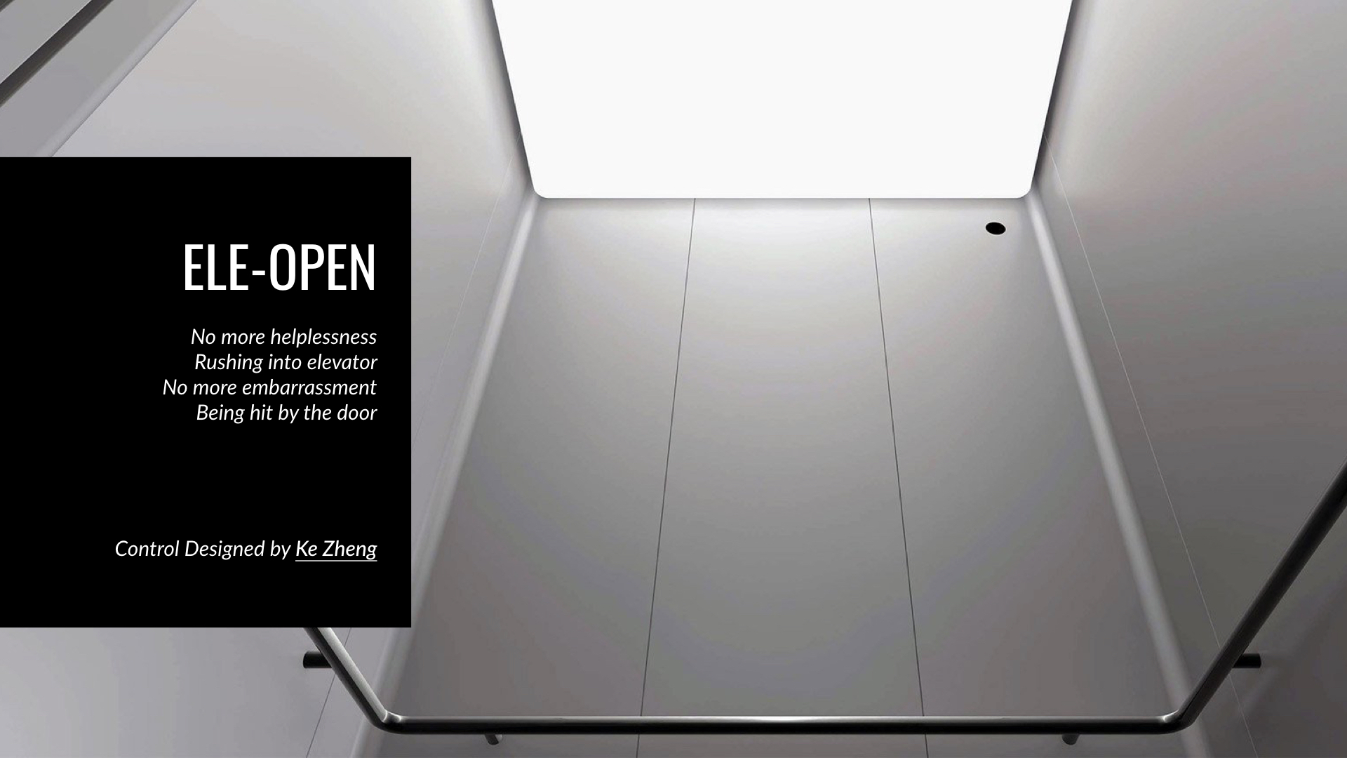
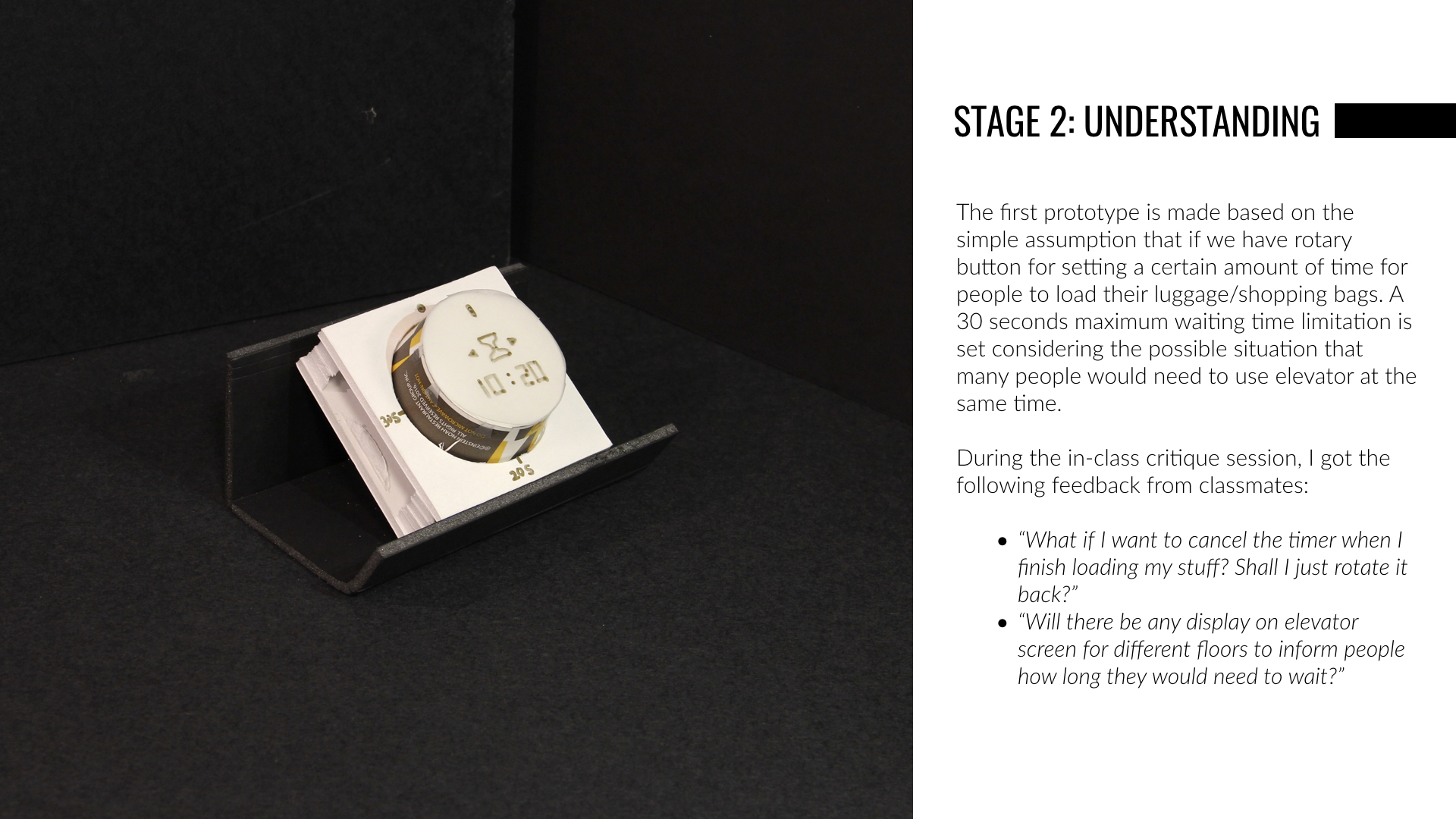
Being crushed by elevator doors for a couple of times when I rushing to catch the elevator and observing that people are struggling with loading luggage or carts into the elevators within limited amount of time, I decided to design the first ever elevator hold-the-door-open control for residential buildings.
The slides below shows the process of Design Sprint through model building and reflection:
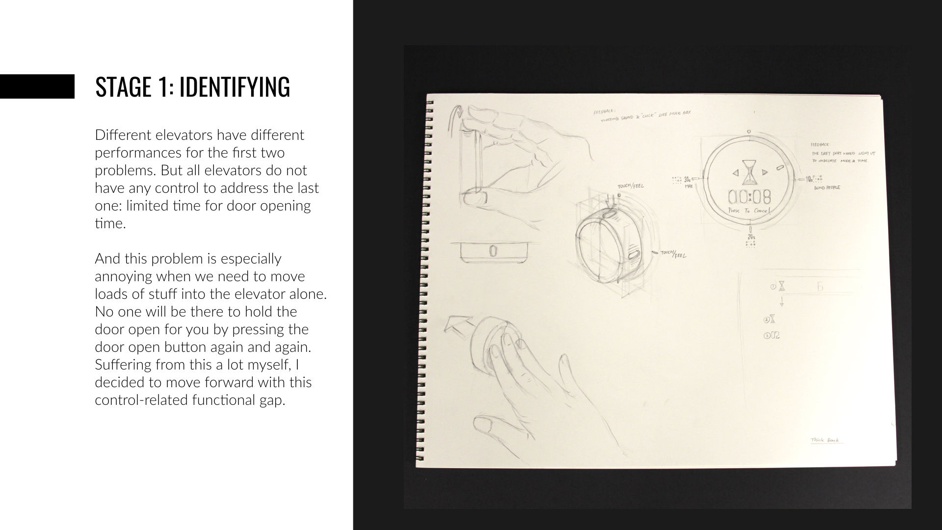
/ 1 Identifying
Visual information processing is a huge part of our daily lives. And data display is the most commonly used information display in public. Examples include data dashboards in different transportation hubs, scoreboards in various sports centre or stadium and the stock screen in investment industry.
Link: Original Data Sheet
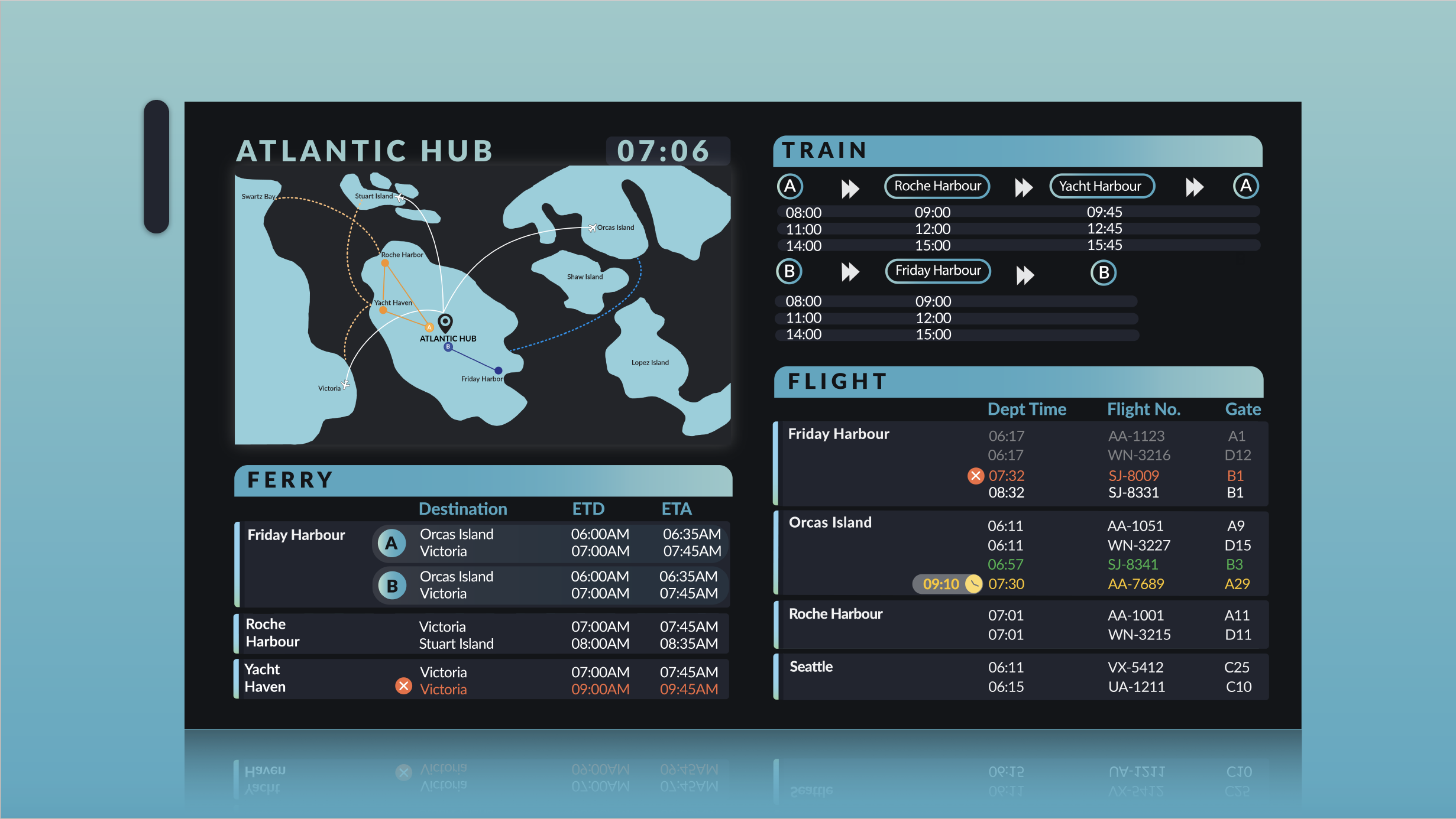
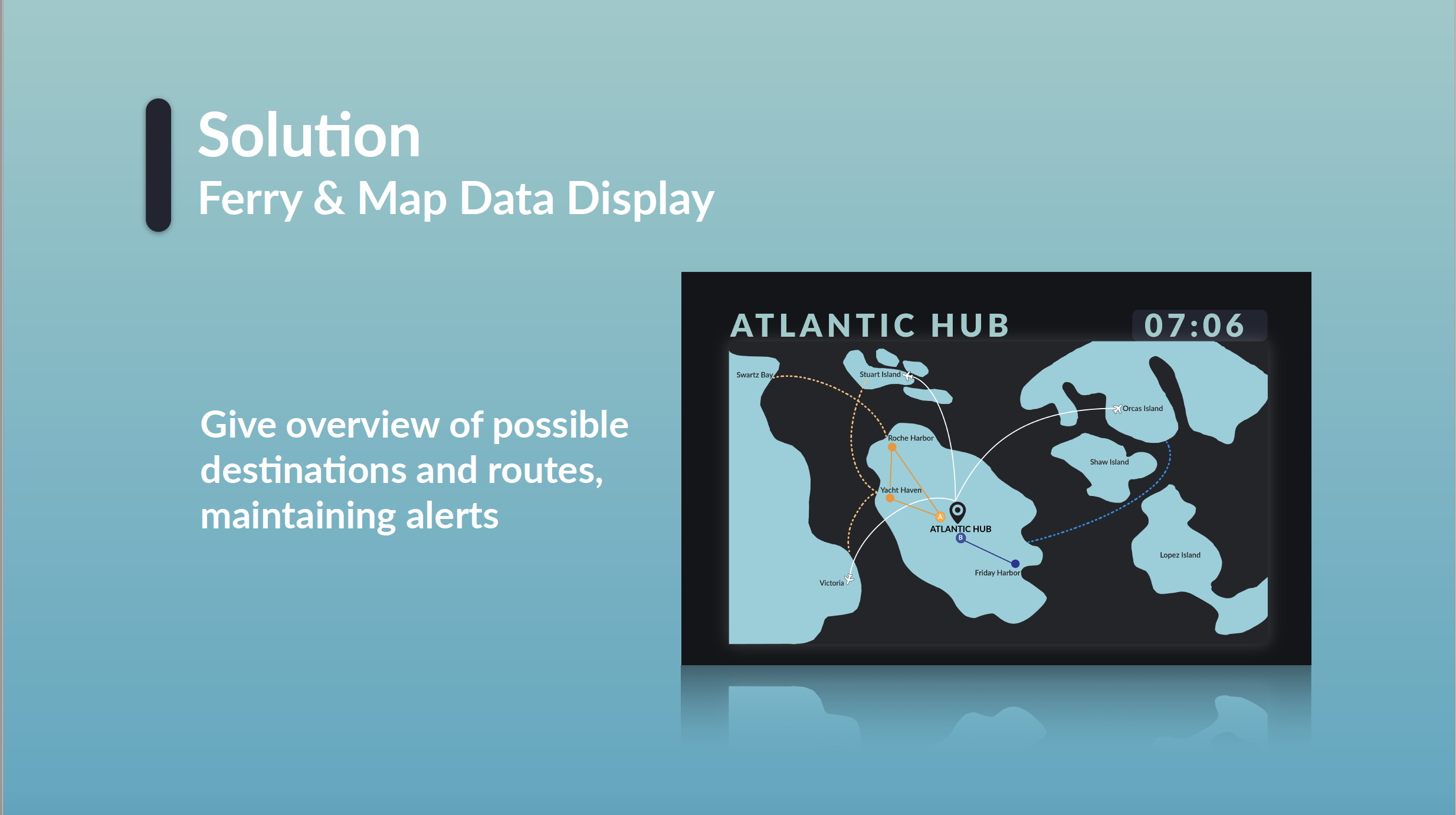
Given an Excel sheet of three transportation methods in Atlantic Transportation Hub, one stakeholder and two users, the team was asked to visualize the data which could meet the needs of both stakeholder and users.
Data is a material that can be designed. Designing with it requires an understanding of the universe of types of data and the relationships between these types. To start with, the team decided to identifying the structures, patterns and connections of data by visualizing the logic flow-- modeling our understanding of the data with diagrams and annotating it to describe cardinality and temporality.

Visualization of Logic Flow
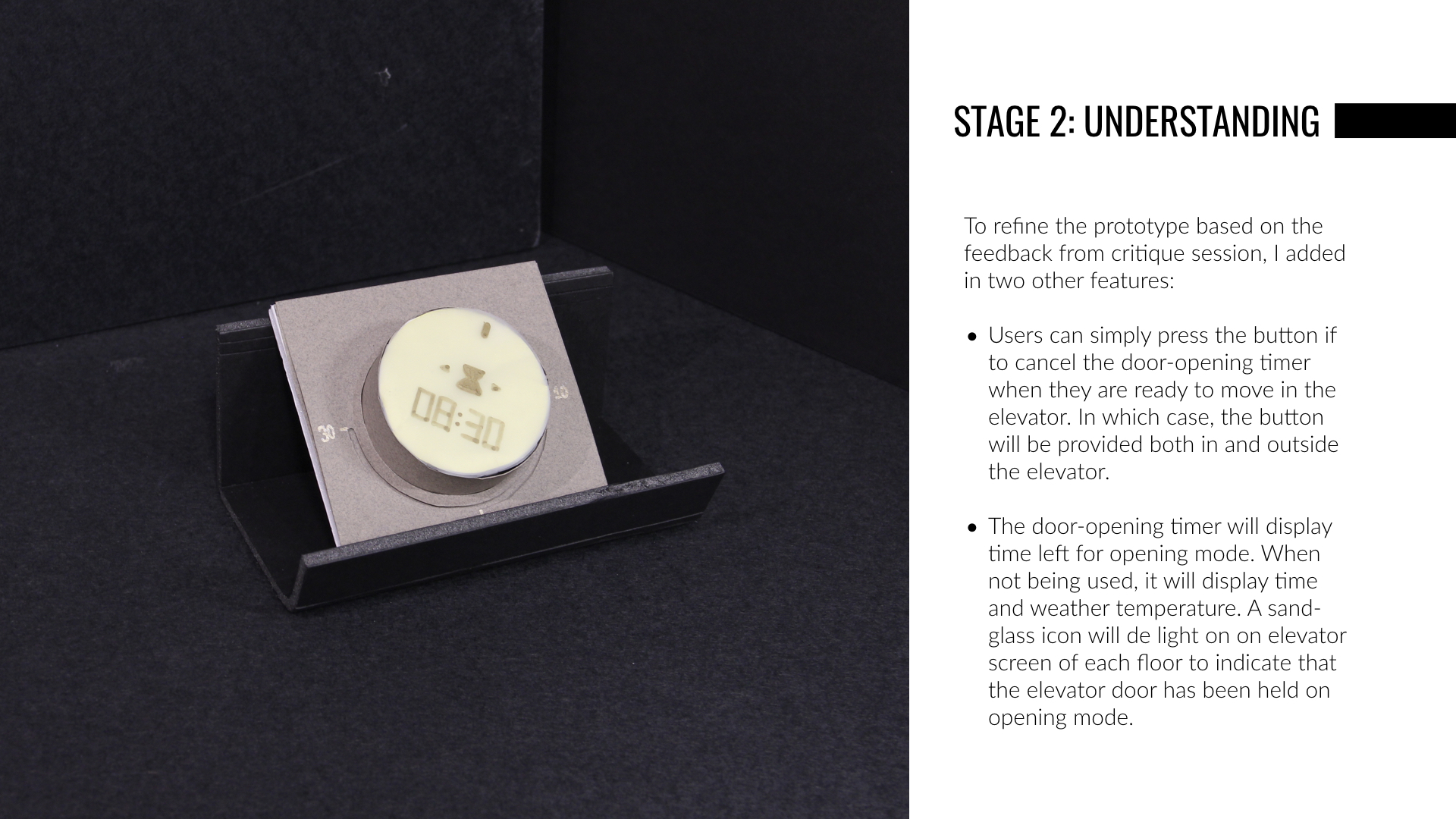
/ 2 Understanding
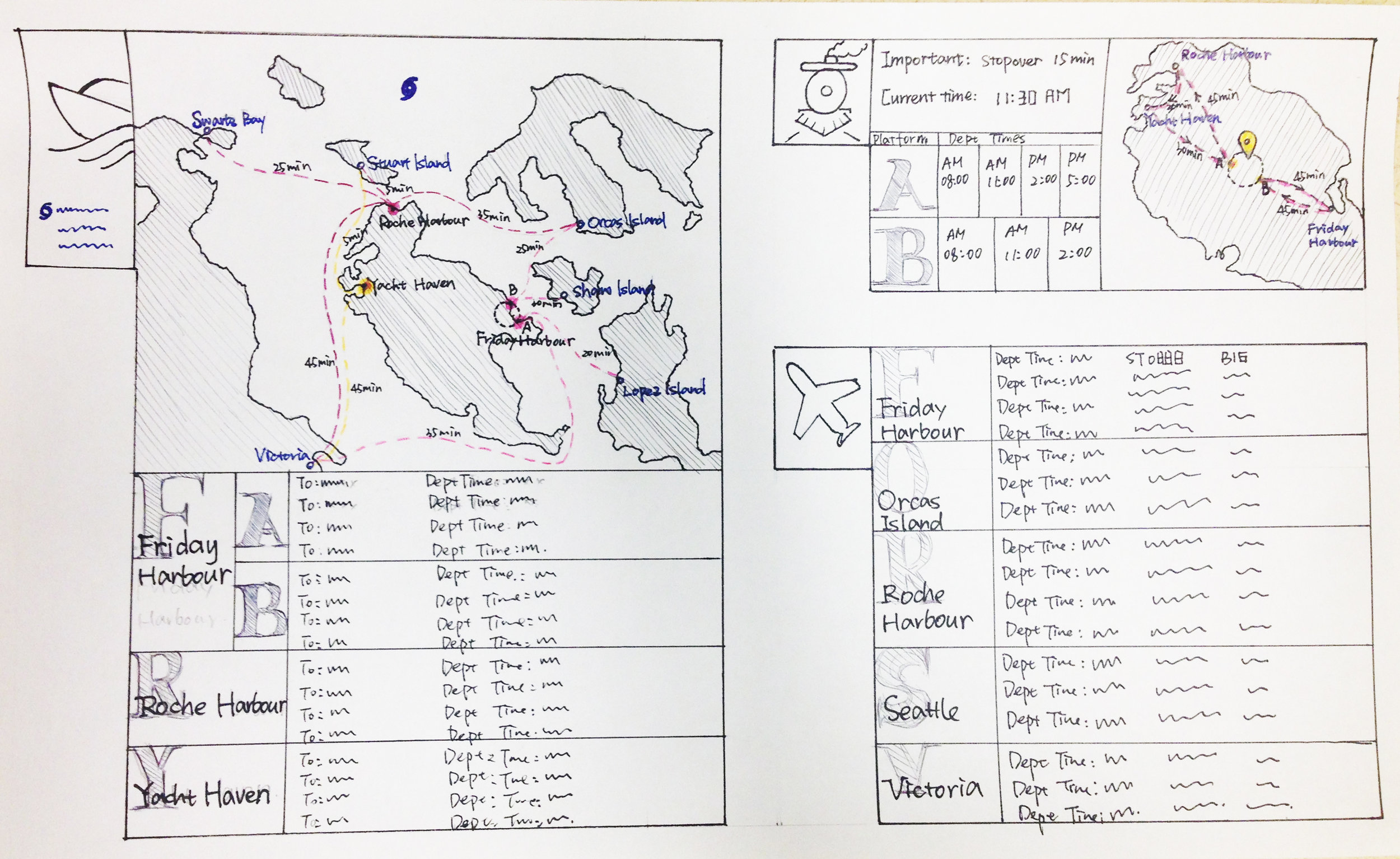
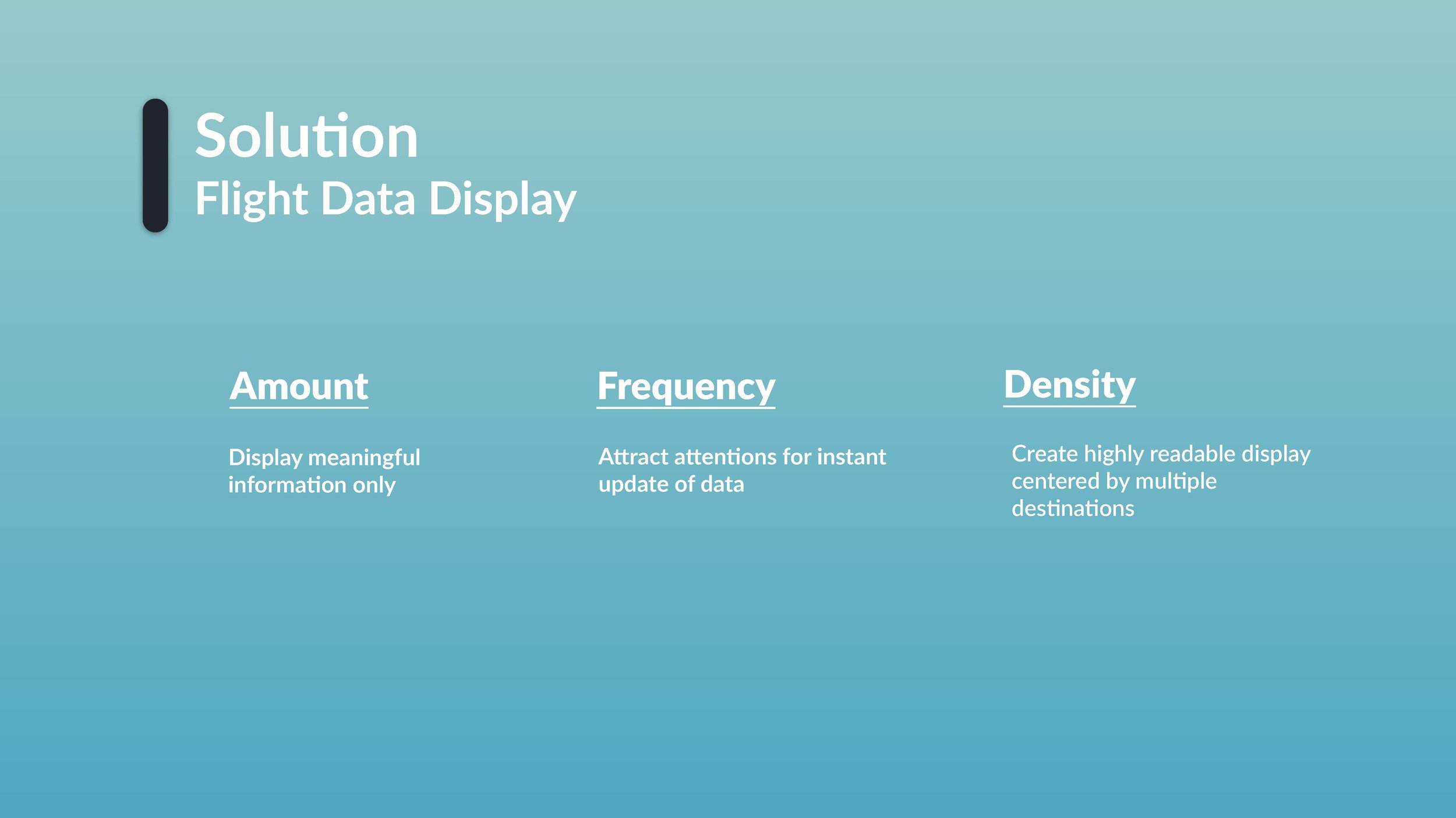
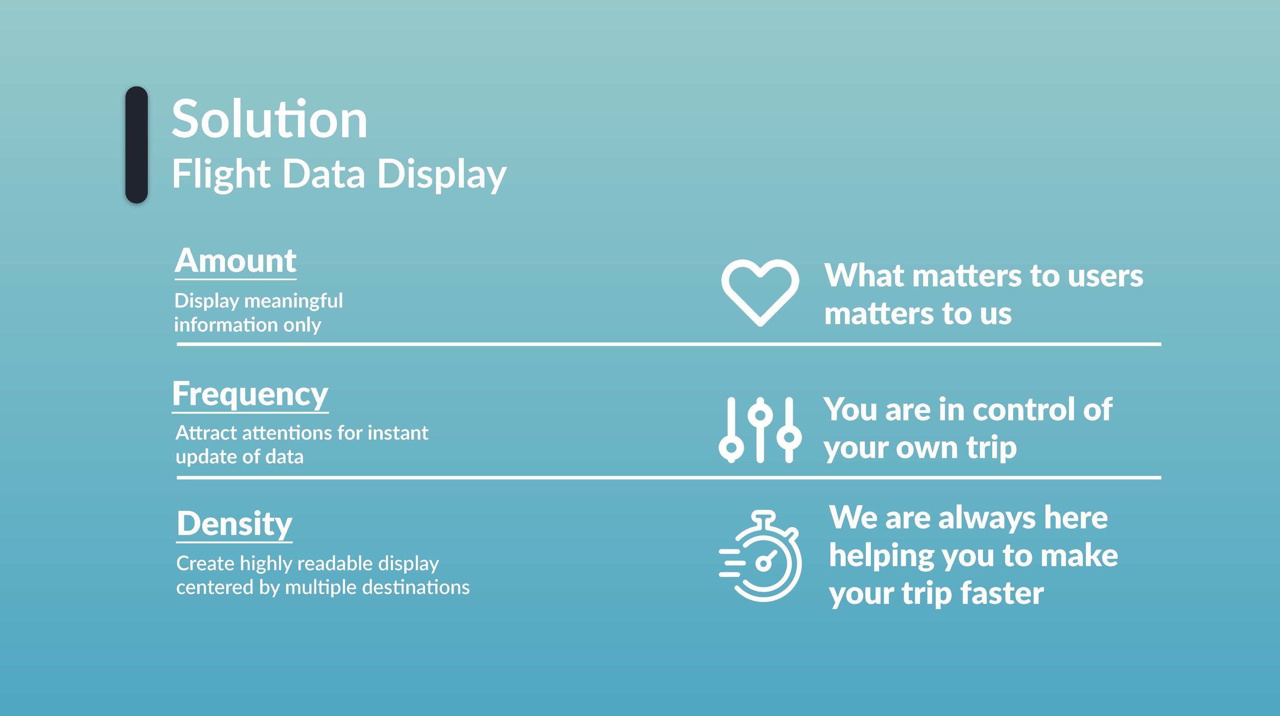
The visualization informs how to present data. Having gained a structured understanding of the available data, we then use hand sketch to rapidly generate ideas for display which satisfies stakeholder's requirement and users' needs. After each hand sketch, we critiqued on each other's work to understand the skillful use of typography, composition and color to create a clear point of entry, clarity, signal important data, support scanning, and provide multiple sequences and/or levels of reading
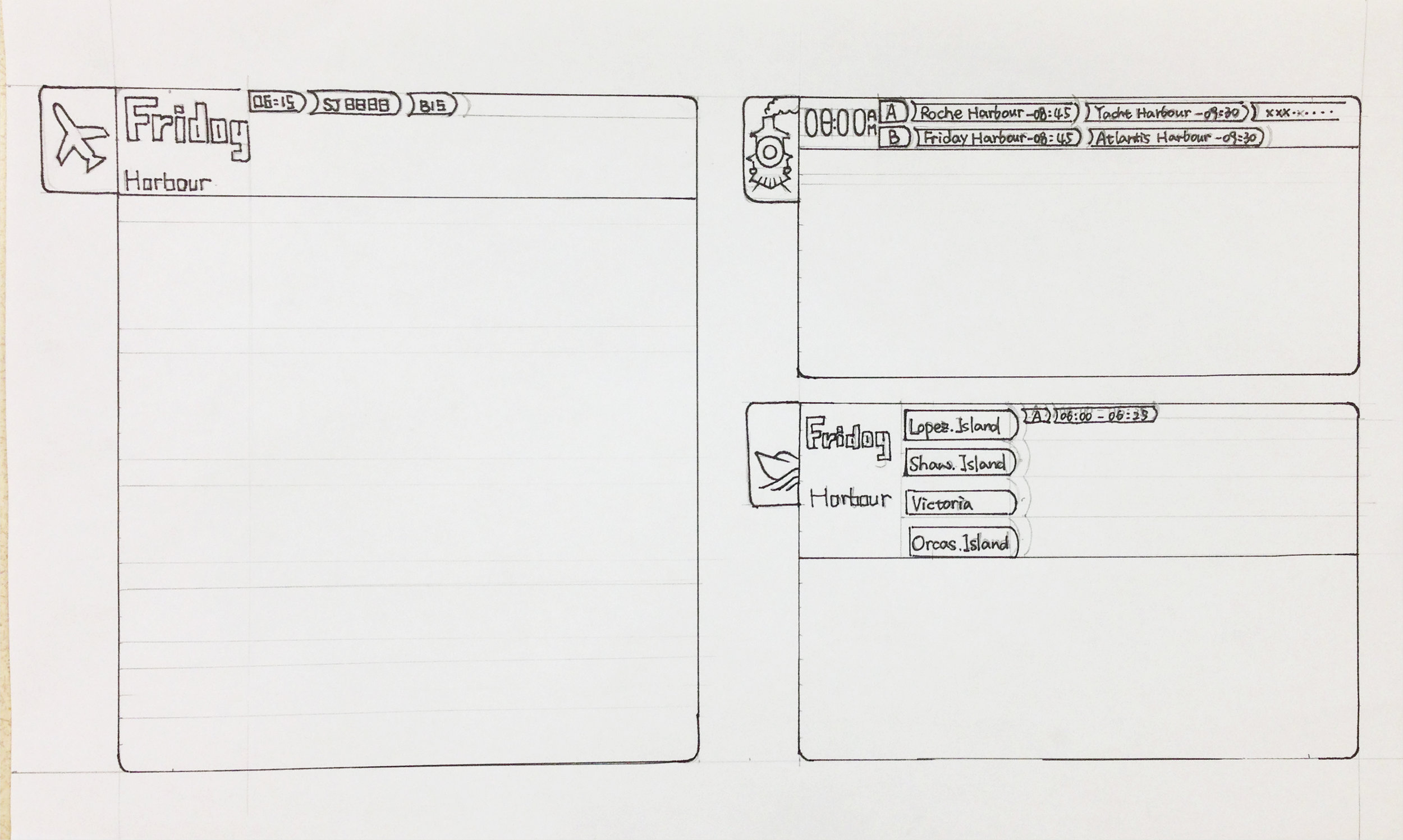
Here are two hand-sketches by me: (left_first round sketch, right_second round sketch)
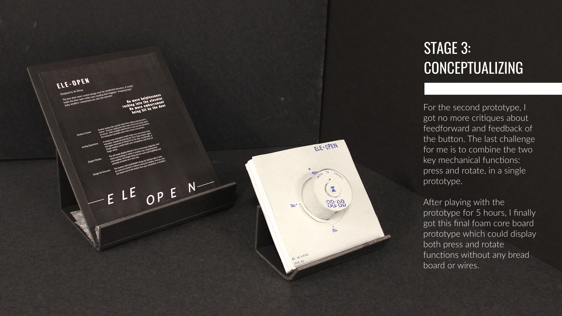
/ 3 Conceptualizing
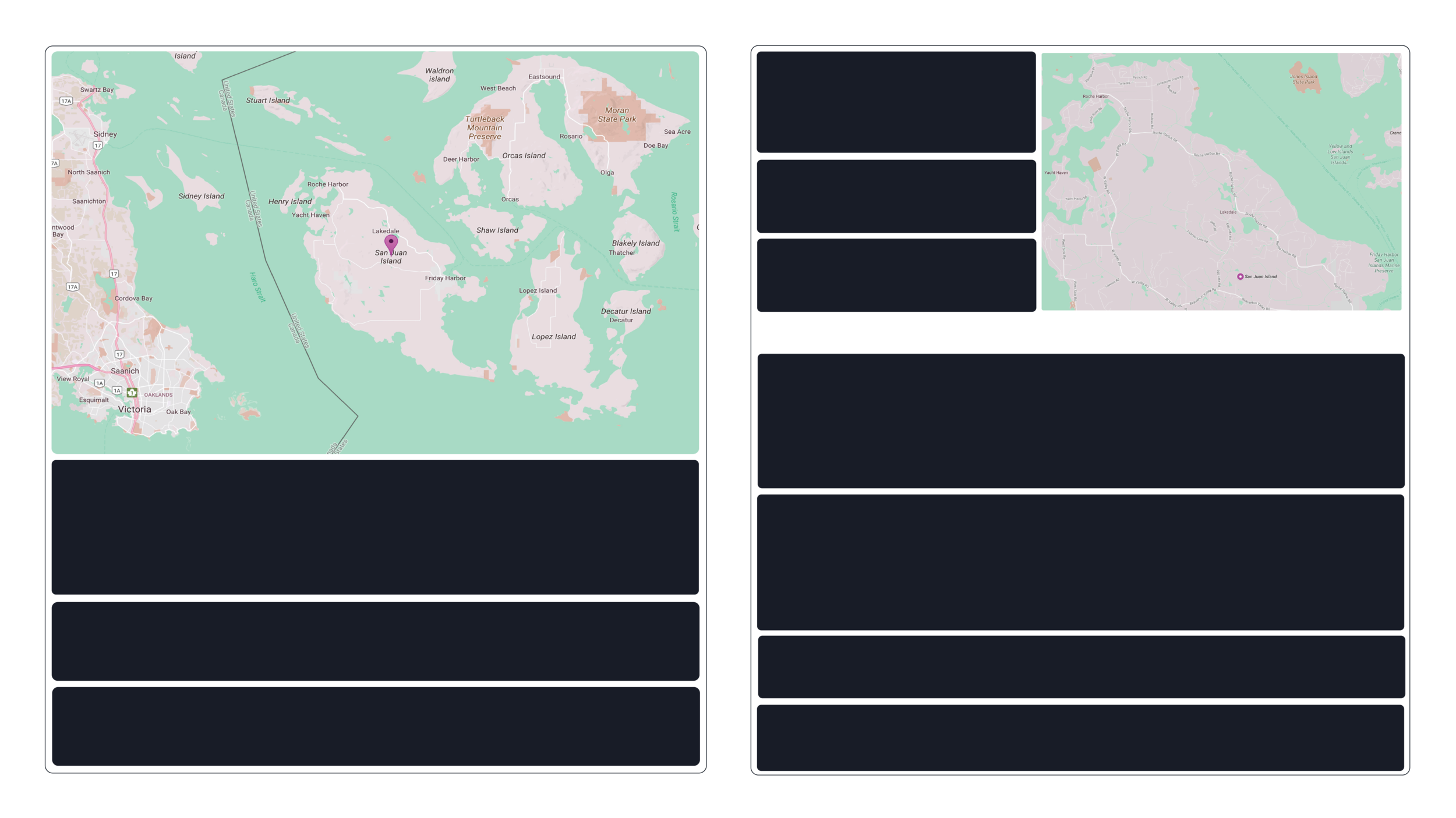
Based on input from the critique, we translated the hand-drawn sketches into digital designs using Adobe Illustrator and refine these sketches to move forward. In the meantime, we also reviewed our data models, personas, and use cases to determine how to best use motion to signal an important change to data.
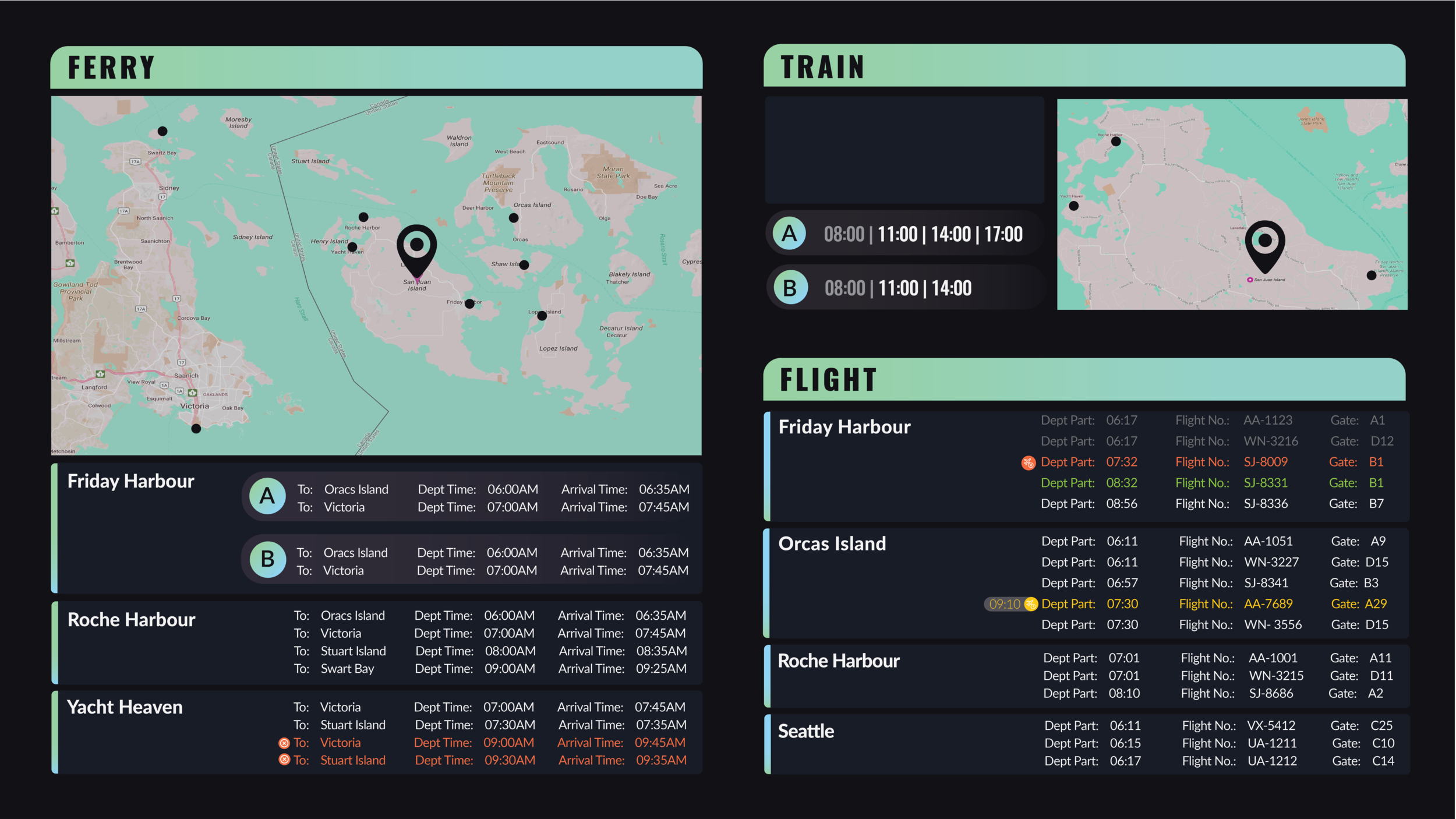
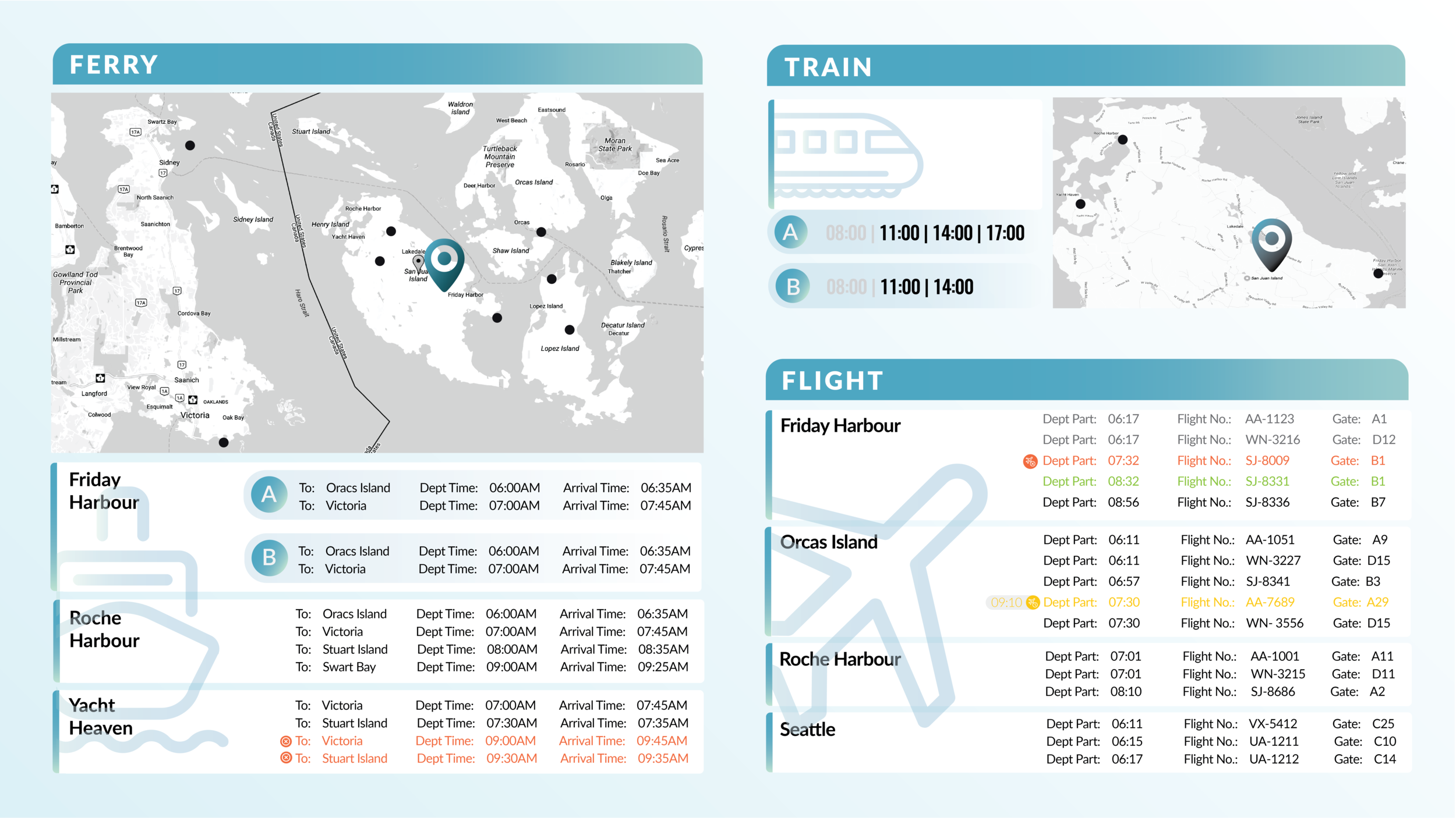
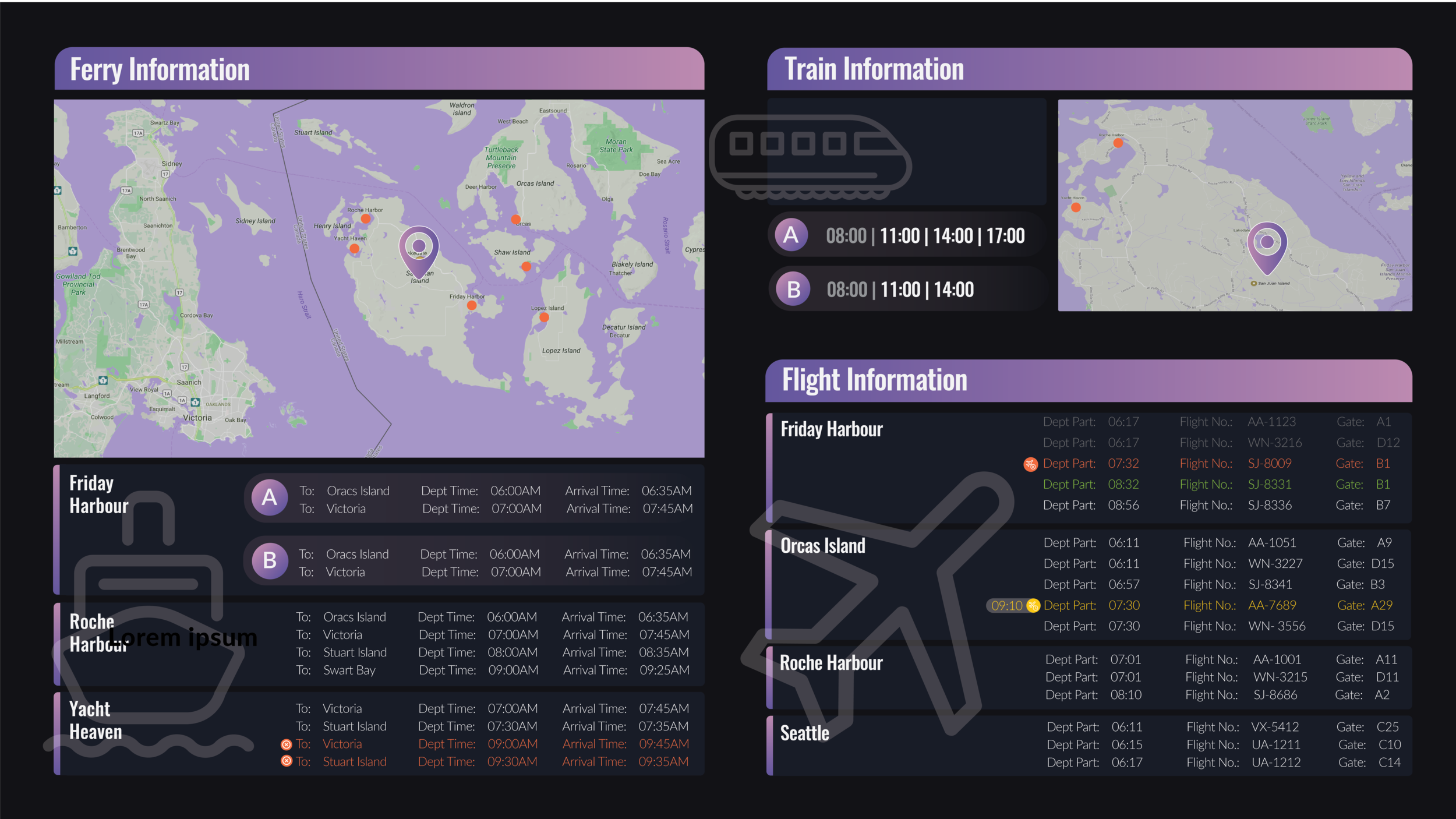

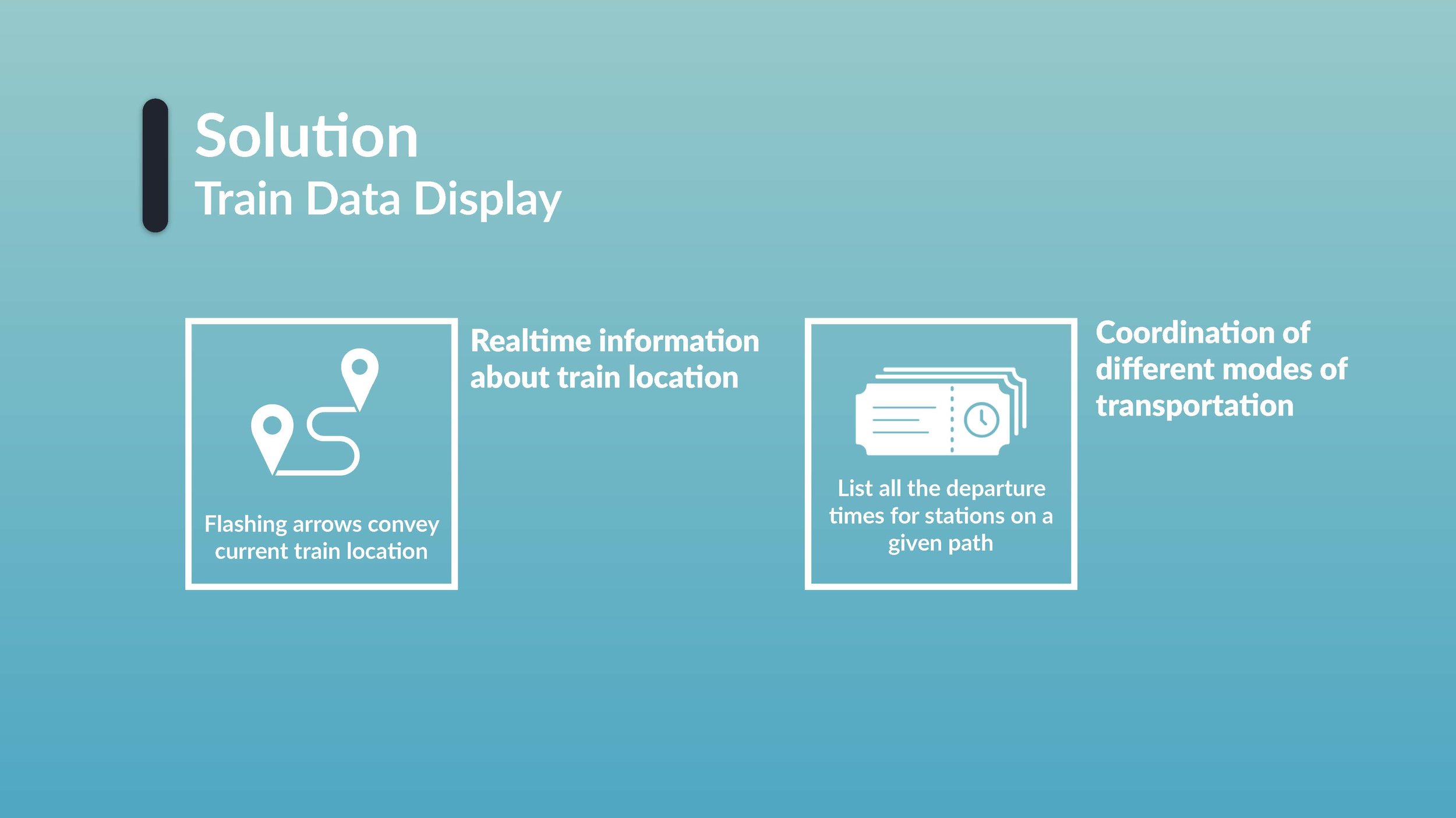
The Final Display
Except for adding in animation in an appropriate way to display data change. I also embedded in different kind of sounds to grab users' attention considering the noisy background in a transportation centre. Please click on the video to view the anime display:
/ 4 Realizing
Upon finishing the design for data display, we decided to present or “pitch” our design to our stakeholders (played by other students) to see if the design meet their requirements and have business potentiality or not.
Here is a glance of our 3-minute design pitch designed by me:

Thanks for viewing :)